
ECOMMERCE / NATURAL HEALTH / LANDING PAGE DESIGN
AATP Funnel
Optimisation
OVERVIEW
Ben's Natural Health is a holistic supplement company and information hub. Working with over 25 doctors globally, they have established themselves as a leading voice for clear and informative health news.
This project is part of a series of iterations and updates I've made to Ben's Natural Health's existing structure and user flows. We optimised and updated other existing landing pages and checkouts following our success with this project.
This version has been developed using UX research tools, A/B testing methodologies, and ongoing collaboration with the marketing, content, and engineering teams.
Each landing page is developed according to WGAC 2.1 - AA compliance rules.
ROLE
Lead Designer
Product Design, UI/UX, User Research, Graphic Design, Interaction Design, Marketing Design, Landing Page Design, A/B testing, Data Analysis
THE TEAM
3 Product Designers + 1 Developer + 1 Copywriter
TOOLS
Figma, Webflow, Adobe Creative Suite (Photoshop, Illustrator), UXtweak, Microsoft clarity
KEY ACHIEVEMENTS
Over 165% Increase in conversion rate to the UK landing
Over 50% Increase in customers making it to the checkout.

The Challenge
Ben's Natural Health has been using landing pages since I began working with the company, however there wasn’t enough emphasis on user testing and addressing fluctuating conversion rates. Alongside two other designers, I was tasked with revamping the landing page and creating a new variant on Webflow. This allowed us to continuously improve our conversion rate using heatmaps, screen recordings and other data from Microsoft Clarity.
Our main product, a 220 page textbook titled "All about the Prostate," addresses prostate disease and advocates a healthy lifestyle. However, advertising strategies for the US and UK markets were identical, ignoring the significant differences in healthcare perceptions.
In the US, healthcare is often distrusted, with doctors and medications seen as profit-driven. In contrast, the UK audience has more trust in healthcare professionals, in part thanks to the NHS. This required not only design adjustments but also tailored language to resonate with both audiences.

Research & Analysis
To kickstart the process, We delved into our heatmaps and user recordings to gain insights into the typical user navigation patterns on the page.
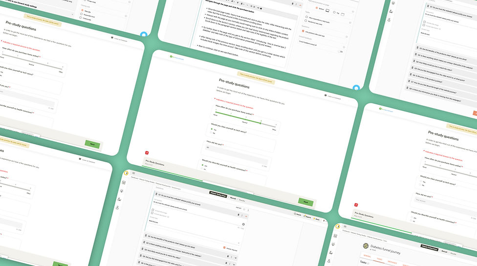
Since we were optimising an existing landing page, we had the opportunity to conduct user research and test studies multiple times throughout its development. Using UXtweak, we initially conducted a two studies on the current landing page design—one for US audiences and the other for UK audiences. The results validated my initial concerns, prompting us to embark on moodboarding and ideation sessions to refine the design for the US market and create a new design tailored specifically for the UK audience.
For a detailed overview of the UX study, please refer to the following link: https://drive.google.com/file/d/1zAqw4dHhpqMA-4bAV2Xot-zEsCuM1W3j/view?usp=sharing
Initial Designs & Development
Upon analyzing the outcomes of our test study, we began crafting initial designs for the US and UK landing page variants. To solidify our proposed changes, I organized a meeting with key stakeholders from the content, operations, and marketing teams, presenting our recommendations supported by comprehensive research findings.
Once everyone was briefed and our objectives aligned, we proceeded to conduct another user study using a high-fidelity prototype developed using Figma and Webflow. This step aimed to gauge the potential impact of our proposed changes on conversion rates.
To ensure a succinct and well-considered design solution, we embraced the recursive design process. This involved empathizing with users through interviews and questionnaires, defining the problem through a blend of primary and secondary research, ideating based on our research findings, and conducting further usability studies on our high-fidelity mockups. This iterative approach allowed us to refine our designs continuously.
Constant iteration, ideation and testing is key to creating a satisfying and lasting experience for our users.


Deployment & Outcome
Following a successful redesign, we conducted another usability study to identify any minor adjustments needed before the official launch.
Thanks to this thorough reflection and redesign, we witnessed a remarkable 165% surge in our conversion rate for the UK landing page and a noticeable improvement in overall user satisfaction, evident from increased dwell time and users navigating further down the landing page then previously.
Quick backs, rage clicks, and dead clicks also decreased.


